

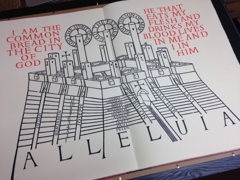
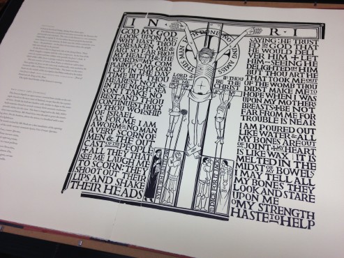
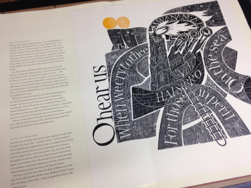
Andrew Anderson’s linocuts on a monumental scale. Indescribable, but the inspiration probably includes mediaeval architecture, Eric Gill, the holy spirit, and the tradition of fine printing on an Albion press.
When I saw them, they hit me straight between the eyes, and I knew we had to make a book of them. At that time Tom Mayo was regularly escaping to the Press from the local art school, and seemed keen to be involved. The linos were large (they just fitted onto our Western proof press), fragile (some thirty years old), and demanding careful inking, with the use of a hand-roller to top up the solid areas for each impression. The Crown format demanded a large type size for the text, which was set in 22- and 18-point Caslon, and printed on the Wharfedale. Two colours apart from black were used for the linos, ochre and terracotta (the colours of Andrew’s shirt and tie on one of the occasions he came to the Press). The result was a tour de force, and the edition soon sold out, a relief as Andrew had kept a low profile with his architectural practice ever since the negative response he had had to and early exhibition of his linocuts.
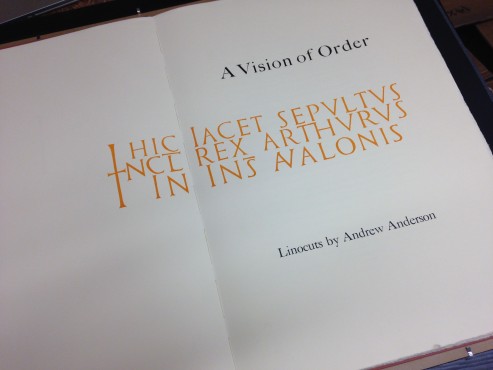
The special copies came with the spectacular nine-sheet image of Cashel that folded out to three by four feet.
This is an ordinary copy.