Vance Gerry & The Weather Bird Press

Vance Gerry pochoir

Vance Gerry pochoir

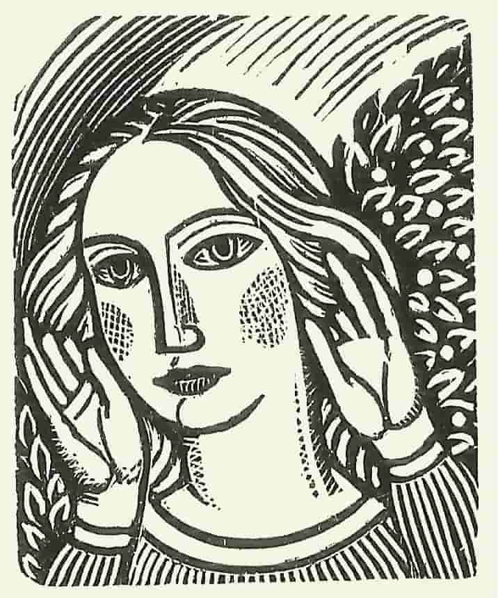
In 2017 the Whittington Press will publish Vance Gerry & The Weather Bird Press in an edition of about 235 copies, illustrated with many of his linocuts and wood-engravings, for which we have the original blocks at Whittington. There will be a selection of his finest pochoir illustrations reproduced by giclée, as well as some line illustrations, and reproductions of a few of his watercolours. The text is based on interviews he gave at the University of California in 1989, together with a selection of his letters from then until his death in 2005 to fellow printers and booksellers, and a few personal reminiscences from those who knew him well. It is followed by a checklist of his publications produced over a period of more than forty years compiled by David Butcher. The book is designed as a tribute to a printer whom we hold in the highest regard, but who is too little known even in his native California.

Vance Gerry began printing in 1963 at the Peach Pit Press. Five years later he changed the name to the Weather Bird Press which he ran in South Laguna, California from 1968. Until his death in 2004 he produced a steady stream (he’d have preferred ‘trickle’) of some of the most understated, beautifully printed and ravishingly illustrated books from any private press, ever. Vance’s lightness of touch, his incomparable facility as a draughtsman, the slightly starved look he gave to the inking of his type, the quiet humour of his writing (when the mood took him), combine together in books that have few parallels elsewhere.
He was undisputed master of the medium of the pochoir, or stencil, technique, and the editions he issued of these, and the other books, are therefore small. The most modest and retiring of men, self-deprecating to the point of carelessness, his work is familiar only to a handful of aficionados over here and in the USA. Nor was he the most diligent of salesmen, and it was often difficult to discover what might be about to come off the press.

The lightness of touch in his work was reflected in his quietness of speech, easy-going humour and modest demeanour. In 1989 he took part in the UCLA Oral History Program, and what follows is a small extract from his interviews with Rebecca Zeigler, published in 1992 as Vance Gerry and the Weather Bird Press. The decade following on from these interviews resulted in some of his most colourful and engaging work, and they form an interesting background for what was to come. By allowing Vance speak for himself, we have attempted to capture at first hand some of that rare personality and talent.

(specimen page)

VANCE: My mother, Clella White Gerry, always took me to the library. She always read; I always read. Although mostly just novels. So the library was not a mystery to me. I was never frightened. In fact, I still feel more comfortable in a library than perhaps anywhere else. I learned to read in spite of being a bad student, but I had no interest in a book as a manufactured object of art. It wasn’t until I worked for Grant Dahlstrom that I began to see. He would point out things about books. And even though I wasn’t interested in printing a book at the time I worked for him, I think his influences were probably all stored away in my mind, and when I did get interested I could draw on those experiences and what he had taught me – I mean, without teaching. It was a work situation; he was not a teacher. It was just what you picked up. He was a book-oriented printer, I would say. Even though he would do a lot of commercial work, his printing instincts were from the book rather than from the advertising world.

I got to be interested in printing when I worked for him. Although I had gone to work for him because I needed some money. This was during the war, and young people could get jobs because everybody was off fighting the war. The men weren’t home, so boys could get jobs. And I could have the money which my father wasn’t going to give me. I mean, no one’s father gave them money in those days. The only way you got money was by working for it.

vance gerry wood-engraving

The edition will provisionally consist of 235 copies set in 13-point Poliphilus type and printed on Zerkall mould-made paper:

40 ‘A’ copies bound in full leather, with a portfolio of some 21 booklets and items of ephemera found in Vance’s shop after he died – most were unbound and we have bound them up in his usual understated style. They perfectly catch the essence of his style of printing and illustration. With a separate facsimile of Vance’s Jazz Instruments, generally regarded as the finest of his pochoir books, and a descriptive booklet of high resolution black-and-white photographs of his workshops in their various locations in Southern California. All in a leather-backed solander box. £2,500 OUT OF PRINT

40 ‘B’ copies bound in quarter leather and one of Vance’s patterned papers, with some 12 items of ephemera, and a facsimile of a pochoir item, in a slipcase. About £950

155 ‘C’ copies bound in cloth and patterned paper, in a slipcase. About £250

Contact us to reserve your copy.

A Miscellany of Type

Miscellany of Type

‘The Typographical renaissance inspired by Stanley Morison in the 1920s, and made real by the technical resources of the Monotype Corporation, left the world of printing with a typographical heritage unique in its five hundred year history – in its diversity, its soundness of design, its scholarship, and its sheer technical brilliance’.

When, in 1985, we acquired the Oxford University Press’ collection of Monotype matrices, we had, when combined with our own collection built up since 1980 when the printing industry was in the throes of its wholesale clearout of anything to do with hot metal, one of the most complete Monotype collections anywhere.

Clearly some sort of celebration was needed, and so the Miscellany came about, one of the most complex and ambitious projects undertaken at Whittington. The purpose was to celebrate Stanley Morison’s and Monotype’s legacy in as pleasing a form as possible. Hence each face took as its text an extract from one of our books, or from our annual Matrix, and ran it consecutively through the sizes, starting with the largest we had in that particular face, usually with attendant wood-engravings, line drawings or typographical ornament. Thus the book could be enjoyed for its content, visual and textual, as well as for its typography, and avoided those dreary lines of caps and lower case prevalent in most type specimen books. It also had the merit of showing off blocks of type in various sizes and leadings.

Miriam Macgregor set most of the display sizes, and where she stopped, often mid-sentence, Peter Sanderson our Monotype operator took up the baton and began setting the largest composition size, usually about 18-point, that we had in that particular face, going down usually to 12-point.

The beauty of OUP’s collection was its depth. Each face came in a complete range of sizes, including the rare large-composition sizes, which often achieved sales of barely more than single figures from Monotype. In each size are complete sets of accents, swash letters, ligatures, and alternative sorts. Few printers would have bothered with all those, and many probably went unused until they came to Whittington. They are now a priceless and unrepeatable asset, in constant careful use by our operator Neil Winter. They represent the high water mark of the Gutenberg Revolution.


Matrix 34

Matrix 34 hits the press next week and will encompass a wide variety of topics, united by its primary interest in printing by letterpress, from metal type. This preoccupation can take many forms, and includes this year:

Printing at a small west-country newspaper using a Monotype caster and a Wharfedale cylinder press; the extraordinary archive of the Officina Bodoni; an insider account of the Westerham Press, the most technically innovative, and amongst the most typographically aware, printers of its time; setting poetry on a Ludlow caster; the inter-reaction of pottery and letter-cutting; selling and installing Wharfedale presses in the 60s and 70s; learning to cut a punch from one of its few remaining practitioners; an untypically warm correspondence with Edward Bawden; a little-known Polish private press in pre-war Florence, using Nicolas Cochin types; working for Gordon Russell; Matisse and the books he created in Paris with Tériade; Stinehour Press and Meriden Gravure; and much else besides, all cast from the moulds of Monotype casters in Caslon, Poliphilus, Goudy Modern, Scotch Roman, Bell and Cochin types, and printed with the crisp impression of an SBB Heidelberg cylinder press: a rare combination of technical and literary excellence – possibly even unique in our careless, digital age.


Venice by John Craig

whittington press

Venice is at last back from the binders, having been on the press for most of 2015. The 80 wood-engravings, and some linocuts, some with colour, have made the book a printer’s challenge. John Craig’s use of white space has, as with Britten’s Aldeburgh (2000) and The Locks of the Oxford Canal (1985), been critical, and the asymmetric imposition of type and images is based upon his precise layouts. The resulting double-page spreads can be seen almost as a series of stage sets, introducing us to the often undiscovered delights of a city which he has visited regularly for the past twenty years.Venice is at last back from the binders, having been on the press for most of 2015. The 80 wood-engravings, and some linocuts, some with colour, have made the book a printer’s challenge. John Craig’s use of white space has, as with Britten’s Aldeburgh (2000) and The Locks of the Oxford Canal (1985), been critical, and the asymmetric imposition of type and images is based upon his precise layouts. The resulting double-page spreads can be seen almost as a series of stage sets, introducing us to the often undiscovered delights of a city which he has visited regularly for the past twenty years.
The French-fold binding style is a new departure for us. The pages are left folded at the top edge, enabling us to use a lightweight Zerkall mould-made paper, specially hot-pressed to give an extra sheen for the engravings, and allowing us to print throughout on the smooth side of the paper only. The book, all copies of which are bound in leather, opens beautifully. Four of the engravings are printed in colour on lightweight Korean and Japanese hand-made papers, and tipped in.

The book comes in three editions, the C edition of which is available here:

150 copies are quarter-bound in dark brown Pirate* leather, with printed paper sides, lightweight boards, and coloured endpapers, in a slipcase. £235 (£195 before publication)
50 copies are half-bound in Oasis leather and printed paper sides, coloured endpapers, and a set of proofs of many of the engravings, on proofing paper, in a slipcase. £395 (£365 before publication)
40 copies are full bound in black Oasis leather inlaid to a design by John Craig, coloured endpapers, and a set of signed prints of most of the engravings, on proofing paper, in a solander box. £1100 (£950 before publication) SOLD OUT

*Pirate leather is another new departure for us, with an interestingly unsophisticated but smooth, dark finish.


Borders used by the Curwen Press

Curwen Press

The following extract is from Matrix 5:

(click image to open slideshow)

The Curwen Press finally passed onto the hands of the receiver in January 1984, and its largely irreplaceable stock of types was rescued from the melting pot in the nick of time by Ian Mortimer, with the help of Michael Heseltine of Sothebys.

In order to do this they had to buy the entire Curwen Press composing room outright. As Ian Mortimer wrote in the elegantly produced eight-page A Short Notice from I.M. Imprimit about the Fate of the Types from the Curwen Press Following its Closure, and the Purchase of the Entire Composing Room Stock, May 1984 (100 copies of which were printed for the American Typecasting Fellowship’s conference in June 1984), ‘The task of moving the type was daunting. The enormity of the operation will be appreciated when it is made clear that the “composing room” consisted in fact of three large rooms together with an office and a store, with some twelve hundred cases of type contained in twenty-two tallboys, twelve single case-racks, countless galleys of stored and standing type and what amounted to about six tons of type in pages, carefully wrapped and labelled on shelves. There were in addition three case-racks devoted to fleurons & borders: one of foundry borders and two of monotype. In all, as the subsequent moving & clearing showed, there were about thirty-five tons of type.’

Thanks to Ian Mortimer’s foresight and perseverance, some of the Curwen types have survived, and a selection of them, and some borders, are shown in the following pages.


The Wrington Wharfdale by Bernard Seward

Wrington Wharfdale

Wrington wood typeIn about 1988 I went down to visit Organs with Bernard Seward, somewhere on the outskirts of Bristol. My recollection is of a large rather unprepossessing looking shed, inside which was a Printers’ Aladdin’s Cave. Most of the floor space was take up with the largest Wharfedale I had ever seen, an Extra-Quad Royal 2 colour used for printing the posters in which the firm specialised. Around it were sloping shelves containing a profusion of wood type, the like of which I had also never seen before, in all sizes, weights, and compressions imaginable.

John Organ told us on a second visit that this collection was destined for a ‘graphic designer in London called Alan Kitching’ whose story is told in Matrix 26, ‘Liberated by Letterpress’, ending with now much quoted phrase: ‘Though locked tight in metal, it’s amazing how liberating letterpress can be’.       John Randle


Continue reading


Minnesota & Whittington

Whittington Press archive

16 of the fifty boxes destined for the archives of the University of Minnesota, total weight almost half a ton, to join the rest of the Whittington archive that has already been there for nearly 30 years. The University had our only complete collection of every book in every edition in 1985, a collection which it would now be virtually impossible to repeat. It will now have all the correspondence files going back to A Boy at the Hogarth Press in 1972, including for the first 32 issues of Matrix, the working material (proofs, paste-ups, layouts) for each publication, and much else besides.

Continue reading


Michael Harvey: ‘Book-jackets’

Michael Harvey Jubilate

Michael Harvey was the finest lettering artist of his generation, following in the tradition of Berthold Wolpe at Fabers. I first met him in 1972 when I worked for Heinemann, for whom he did some work. We discussed the idea of him doing an alphabet for the embryonic Whittington Press, but sadly nothing came of it. In Matrix 26 he described his apprenticeship with Reynolds Stone, and in Matrix 27 his earlier time stonecutting with Joseph Cribb, who had worked with Eric Gill at Ditchling before the war. John Randle

Continue reading