‘The Typographical renaissance inspired by Stanley Morison in the 1920s, and made real by the technical resources of the Monotype Corporation, left the world of printing with a typographical heritage unique in its five hundred year history – in its diversity, its soundness of design, its scholarship, and its sheer technical brilliance’.
When, in 1985, we acquired the Oxford University Press’ collection of Monotype matrices, we had, when combined with our own collection built up since 1980 when the printing industry was in the throes of its wholesale clearout of anything to do with hot metal, one of the most complete Monotype collections anywhere.
- Baskerville
- Bembo
- Bodoni
- Caslon
- Caslon swash caitals
- Centaur
- Cochin
- Fournier
- Garamond
- Gill Sans
- Goudy Modern
- Lutetia
- Modern No. 20
- Perpetua
- Plantin
- Scotch Roman
- Times Roman
- Van Dijck
- Walbaum
- Title page in Caslon & Bodoni
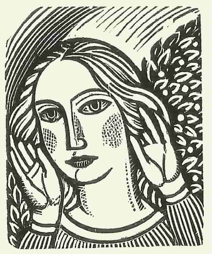
Clearly some sort of celebration was needed, and so the Miscellany came about, one of the most complex and ambitious projects undertaken at Whittington. The purpose was to celebrate Stanley Morison’s and Monotype’s legacy in as pleasing a form as possible. Hence each face took as its text an extract from one of our books, or from our annual Matrix, and ran it consecutively through the sizes, starting with the largest we had in that particular face, usually with attendant wood-engravings, line drawings or typographical ornament. Thus the book could be enjoyed for its content, visual and textual, as well as for its typography, and avoided those dreary lines of caps and lower case prevalent in most type specimen books. It also had the merit of showing off blocks of type in various sizes and leadings.
Miriam Macgregor set most of the display sizes, and where she stopped, often mid-sentence, Peter Sanderson our Monotype operator took up the baton and began setting the largest composition size, usually about 18-point, that we had in that particular face, going down usually to 12-point.
The beauty of OUP’s collection was its depth. Each face came in a complete range of sizes, including the rare large-composition sizes, which often achieved sales of barely more than single figures from Monotype. In each size are complete sets of accents, swash letters, ligatures, and alternative sorts. Few printers would have bothered with all those, and many probably went unused until they came to Whittington. They are now a priceless and unrepeatable asset, in constant careful use by our operator Neil Winter. They represent the high water mark of the Gutenberg Revolution.


